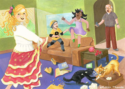
I was so excited about this week's word because it applied to my current project. You could say it also applied to my last posted illustration with the robot too, since that one was an old sketch I modified. This week, I am doing another one of those 'before' and 'after' pictures. The before is actually a rework of a previous IF prompt 'rambunctious'. I liked the idea, but was never quite happy with the end result. It was time to MODIFY the old one and play around with composition, line, color and well...see for yourself. I'm quite happy with the outcome.
Hope you have a great week and don't forget to check out my contest.


24 comments:
LOVE IT - oh the JOY is really there. The other was mischievous, this one is pure joy and having fun for the sake of fun, love the expressions though I do adore that blond and her curlies.
Edrian--wow, you just keep getting better and better! I really like the composition and lines in the second one, but I feel the first one has better color. The second doesn't have as much value range (except for the dancer's hair.) And the first one has a nice almost triad color scheme while I feel the second one has colors that are competing with each other. A friend pointed me to an awesome color website the other day: Color Scheme Designer
Much more life in the new version.
The first had everyone frozen in time, but you can see the movement in each character in your new illo.
My only suggestion would be to show one of the dancer's legs.
Nice work!
Thank you Annie!
Heather, Thank you for your suggestions. I agree with the values they needed to have a better range. I added some more as well as changed the color on some things to keep the visual focus on the right areas.
Tom, I could not agree with you more. The 'frozen in time' look is what bothered me the most. I'm glad you can notice the difference!
well done!!
I'm so glad to know your beautiful work !!Thanks for your comment,you are always welcome!
I saw your webpage and love each one of yours "sweet" illustrations.
Have a nice week
Haha! I love it!x
I like them both, but the newer version has a freeness to it that makes it special. The subtle changes made all the difference and you took something that was already good and made it great!
There is such joy and happiness in your work! Thank you so much for commenting on my art blog, especially, since it has allowed me to follow you back to your colorful corner of the world.
:-)
Well-wishes,
me
First, Thank you for your nice comments about my work.
Now YOU! Wow! Now that's "Modify". I know nothing about Computer art, But you did the first piece in the traditional way. You then took the ary,scanned it, printed it, and worked again in the traditional way. So nice to see another outcome (modification) of the 1st piece! FUN.
Looks like there's a lot of life in that living room! Great job on "modifying."
Hey Edrian ! you have a great stuff mate !! I really like.
ceers.
I like the movement and the round fish-eye lens perspective you put into the second one. I think it's more dynamic (although I do like the facial experessions better on the first one)!
great to see the two versions and compare them, edrian. i think they both have great, but different qualities. i haven't visited your site for awhile, i like what you did with the template.
Wow! This is lovely!
I love your modified one, it is much more free and vibrant. Also appears to have more space and looks more contemporary. A lovely piece full of fun - interesting to see the changes.
I love both versions! they are so full of fun that i wish i could join them!! Great composition with nice colours
Hi Edrian, I like both. I love the softness of the first one and can appreciate the composition and energy of the second one. Really nice.
Fantastic! I prefer your modified illustration. The colours work well and there is so much more life in your characters. Love the dancer's face.
oooh, they are both wonderful, but the second one has so many more line and color elements that make it really pop! Great work.
Its so awesome that you are willing to redo the scene in completely different mediums. Definitely someone willing to put in the time and effort! I love the result, I think the "after" is so much more focused and lively. Yay!
what a wonderful "alteration" - this looks great in photoshop - superb!
You did a great work:)
The second illo is more lively but I loved also the old one:)
Great idea!
Love the colors!
Francisco
Post a Comment