Sunday, June 29, 2008

Illustration Friday: FIERCE ... love of nature


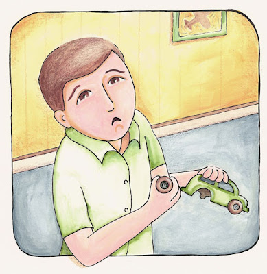
This is my illustration for this week's topic FIERCE. I am also using this illustration to participate in Alicia's giveaway.  
The book she illustrated "The Wish Trees" is now available at Amazon, B&N and other major stores and to celebrate she is having a contest (Kudos Alicia!!!). All you have to do is create and send her an image that depicts the importance 
of a tree. She will have her children be the judges... but hurry if you want to participate, the deadline is July 4th! For details visit her blog.

This is a sketch I had originally done for this week's theme and I thought I would have time to color it, but this week is turning out to be a little more family oriented.


Friday, June 27, 2008

Poll results are in!

First I want to thank everyone that participated by voting or commenting in last week's poll about which illustration style you liked better.  Before I get to the final results I wanted to explain why I had the poll. In my other life time (before I had kids) I used to be involved with focus groups to test user interfaces, navigation and design for web sites. I was always amazed by some of the findings, and learned that for successful design you cannon create in a bubble, you need to always get other's opinions.
I have been creating in my studio (my bubble) for quite some time, and sometimes my objectivity gets a little skewed, so I decided to have a poll and conduct my own little focus group. The results basically corroborate what I think...which is a strong preference for the acrylics and ink. However, as Eric suggested, I will not limit my options to only one medium. If I can translate my style to different mediums successfully, I think it would help my marketability.  In other words, I have a long road ahead of me. 
Thanks again everyone...you really helped me get some perspective!

Final Poll Results:
56 total Votes
DIGITAL: 16 (28%)
ACRYLICS AND INK: 40 (71%)

Thursday, June 26, 2008

girl eating sandwich

This is another spot illustration from the sketches I posted yesterday. I like the colors and the texture of this one. I think I may use it for a business card. I also like the sad girl (previous post), but I don't do a lot of colored pencil work, so I don't know if that may be a good spot illustration to represent 'me'.  I enjoyed the colored pencils so I may work more with them too.

I may go back and re-do the sad girl in acrylics and see what I think then.
As always, I welcome your comments and suggestions...


Wednesday, June 25, 2008

sketches and spot illustrations of children

I took my son to the playground yesterday and was very inspired by all the kids that were there. I made a few sketches and then turned some of them to color and timed myself just for practice. I was pleased with the outcome.

Sketches

This one is from a couple of weeks ago at gymnastics


Girl with teddy and blanket. Acrylics and ink (under 1 hour)
This little girl was just adorable!

Sad Girl. Color pencils and ink. (about 1 hour)

Sunday, June 22, 2008

Illustration Friday: HOARD


This is my interpretation of this week's theme HOARD.  My first thought was a squirrel. However, the idea of a dog hoarding bones and then forgetting were it buried them, appealed to me. I am sticking to paints and ink on cold press for now. I am fascinated by the votes on the poll I have going on. 

Friday, June 20, 2008

I am taking a poll

DIGITAL                                   Vs.                     ACRYLICS AND INK
I am posting two versions of the same illustration as an exercise I did this week. I worked from an existing sketch and both illustrations took me about the same time to finish. I would love to see what people out there like better, the clean, crisp edges from the digital piece, or the more rough around the edges look from the painted version.

Thursday, June 19, 2008

IF: Worry - Color Version


So I thought I would be taking a break from illustration this week, but after reading so many blogs and web sites... one of them Dani Draws and finding a ton of very useful information there, I had to get back to my studio. By the way, Dani's site has great tips for illustrators and artists. Check it out if you haven't already. His work is amazing!

So this morning I set out to try something a little different with my technique. I used acrylics, colored pencils and ink.

I used the sketch from an older post for IF.  This one took me 2.5 hours. Once I scanned it, I muted the colors a little to help the mood.

Monday, June 16, 2008

Fall, Summer, Spring Sketches

Here are the sketches I worked on to showcase my style. I am doing these as an exercise, and if I like the outcome I may use them as promotional pieces. The idea is to keep the main composition the same with the tree framing the piece and kids and animals as the visual focus.

I have been in a bit of a funk creatively lately and I may take a break from the children characters and animals. As I said on my previous post, I am in the midst of finding a style that is marketable and quick to do while being true to myself. I am not sure where I stand on the style or quickness of things and I think I need to step away for a little while to get some perspective.

spring

summer

fall


In the mean time, I'll probably work on a piece I've been wanting to paint. We'll see how the week progresses.

Your thoughts and feedback are really welcomed!

Finding a style.

I have been trying to figure out were I fit in as an illustrator. This past Saturday I attended a meeting for the local SCBWI. The moderator Sylvia Andrews was very nice and helpful and everyone who attended was very supportive toward each other. It was a very nice experience. Although there were no illustrators there, it was nice to listen to the writers talk about character development, plot; ‘show it, don’t tell it’ and other comments that helped me understand that what is important to writers is also important to illustrators. I will attend next month’s meeting. I will be able to show my work and get some feedback from the writers.

I also read and article by Kathleen Reitz on discovering your style. I found it very honest and insightful.
I have been trying to sketch every day in what I think is my style. Some days it flows and feels very natural and some days it feels like I’m stuck. Does anyone go through this?

When I do small paintings, I can finish one in about 2 hours. However, the illustrations are taking me a lot longer. About 10 hours. I know it’s way too long, but I always get caught up in the details. I need to experiment more with that. Suggestions anyone?

I have been working on 4 cards to represent the seasons. So far I have sketches for summer and spring. I am incorporating kids and animals. I will be posting those later. If they turn out nice, I may use those as portfolio pieces or promotional pieces. Stay tunned!

Saturday, June 14, 2008

Illustration Friday: punchline


This week's theme was a challenge! I don't think I have ever illustrated something humorous! I am not very good with punchlines. I usually choose my words carefully and punchlines are for witty quick minded individuals. That is not to say that I don't have a sense of humor. 

Since I could not come up with something unique, I decided to use one of my daughter's favorite jokes. I am not sure who to give credit for this one, but I have heard it in songs, and on TV and even at one of Disney's attractions.

As for the illustrative style, I parted from my usual style because I could only visualize this with flat geometric shapes. I thought it would be a great exercise to do it on the computer. I used illustrator for this one. I started it on Photoshop and a few minutes into it, I realized that illustrator would give me more control over the paths.

Comments and critiques are welcome!


Wednesday, June 11, 2008

Just One More Book


This is my entry for the Just One More book logo and web site re-design event. This site is pretty amazing! It has a ton of interviews and conversations with authors and illustrators and it also has, reviews of your favorite books. I found out about this blog through Alicia's blog. If you get a chance definitely check it out!

Tuesday, June 10, 2008

IF: Forgotten - Child


This is my interpretation of this week's theme. I wanted to pay tribute to all of the forgotten children in the world.  The homeless kids that roam the streets aimlessly and have no refuge. 
In Colombia, my homeland, these kids are called 'gamines' sometimes they are also called throw away children. If you want to find out more about these kids or if you want to help one visit 'Let the Children Live', an organization that helps gamines in Colombia.

Sunday, June 8, 2008

Girls and a Tree House


My daughter had a friend over and they were playing outside. They inspired me to draw them and since I had a little more time this week, I decided to paint them just for practice. I read somewhere (I forgot where) that it is important to draw children and depict different ethnicities so I wanted to give it a try.  This time I used acrylic paint on illustration board. I realized the paint behaves differently on the board than on the canvas. I ended up working with it very wet so that I could get the effects I was looking for. I still would have wished for the skin tones to be lighter, but overall I'm happy with it. So is my daughter, who's thrilled that I illustrated her and her friend!


Oh, I also had some time to add a graphic to the title of my blog.  I recycled one of my recent illustrations. I think I may change the title graphic often to reflect my most recent work. We'll see.

Thursday, June 5, 2008

My First Tag!

My first tag! Oh my!
My friend Nicole Merkens just tagged me and I need to reveal 6 unusual facts about myself…so here’ it goes:

  1. I can’t swim, at least not too well. I grew up in the mountains in a rainy city where the temperature hardly ever reached 60. I was never around water, so never had to learn. Now I live in Florida and I am completely intimidated by water. If I was on a ship and the ship sank…I would definitely not survive!
  2. Breakfast is my favorite meal! I cannot skip breakfast or I become very cranky. Just love eggs, croissants, pancakes, bacon, sausage, yummm! I’m salivating already!
  3. I know how to drive stick shift, but prefer automatic. Just hate the shifting every 2 seconds when you are in traffic. I guess I’m a lazy driver!
  4. I like to work with background sound. It could be music or TV, but can’t concentrate if it’s all too quiet!
  5. I don’t like olives or anchovies.
  6. I can’t ride a bike. Don’t know why I never learned, but when I was 15 I tried and was horrified by oncoming traffic. I’ve wanted to learn just so that I can ride with my kids, but falling when you are older just hurts a little more than when you are younger.

Well, that’s my “6 unusual things about me”. Don’t know if they are all that unusual, but that’s what I came up with.

The rules: 
  1. Link back to the person that tagged you
  2. Post these rules on your blog.
  3. Share six unimportant things about yourself.
  4. Tag six people at the end of your entry.
I know I'm supposed to tag people, but I will leave this one open for anyone that wants to participate. (If you do, let me know and I will post a link to your blog) Thanks!

Monday, June 2, 2008

Illustration Friday: baby


This is my illustration for this week's theme 'baby'. I did this in gouache on illustration board, which is a medium I haven't used in years. I have to say, it was not easy. I am so used to acrylic paint and canvas that I felt  I did not have much control.  I spent waaaay too much time on this little illo, but it was a great exercise. I'll definitely try gouache again. Practice makes perfect, right?